Wednesday, November 30, 2011

Lab 8 Final Project- Mapping the Station Fire


August 26, 2009, the Station Fire started in central Los Angeles County in Angeles National Forest. The fire was 98% contained by September 27, and spread over 160,000 acres (251 square miles). The fire started in the southern part of the forest and spread to the North over the next few days until it was mostly contained. Over the time period, the fire mainly stayed within the boundary of the forest. Therefore, damage to homes only could occur on the northern most border of the populated area. At least 18 homes were destroyed. The fired threatened houses and other structures in La Canada Flintridge, Glendale, Acton, La Crescenta, Pasadena, Littlerock and Altadena. The goal of this project to see what the population density looked like for areas near the fire.


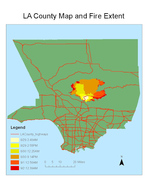
My hypothesis was that the most population dense cities in the county would be minimally affected by the fire. To test this hypothesis I created a fire extent map. This map showed the extent of the fire at different times and days. My main focus was looking at the furthest extent of the fire. I created 2 buffers around the furthest extent (9/2 12:39AM). The first buffer showed the area within 2 miles of the furthest extent. The second buffer showed the area within 4 miles of the furthest extent. This illustrated which areas were under high, low, and medium threat. 


I then collected data on cities and population. I found a shape file of Los Angeles County cities and added it to the map. I also found data on population of most of the cities. I joined these two attribute tables so that I could compare the different cities on the map. I decided to map population density as opposed to just population. This is because population density gives values that have already taken into account area. If two cities have the same population, the city with a larger area will have a smaller population density. This larger city will be more safe in terms of evacuating during an emergency. Though Los Angeles has the highest population, it is not very population dense because it covers such a large area. Population density, not population is what matters in terms of safety in an emergency.


After mapping out population density of different cities, I found that my hypothesis was somewhat valid. The areas with very high population densities (10,000+ people per square mile) were relatively far from the fire (8-10 miles). However, not all areas near the fire were of low population density. Some areas were still of medium population density (7000 people per square mile). However, for the most part the northern part of the populated area was not as population dense as the rest of the county. In terms of evacuation and safety, this was a very good thing. No area within the 4 mile buffer was above a population density of 8000 people per square mile.


I also looked at the elevation models of the fire extent. The graphs dealing with elevation only contain areas near the fire, not all of the county. First, I created a hill shade and 3D model of the area's elevation. I found that most of the National Forest (where the fire extended), was of higher elevation, and the populated areas were of lower elevation. I also mapped out the fire extent over time on top of the elevation models. At each time period, there is a map of the elevation and fire extent. As shown by the maps, the fire starts at the southern end of the National Forest. The fire then spreads northward. In terms of elevation, the fire generally spreads to higher elevation. It does not spread downhill into the populated areas and cities. While one could assert that the fire spread northward because it was attracted to higher elevation, that is not the most probable conclusion. It is more likely that the fire spread in that direction because of wind direction and the direction that the dry forest was located.


In conclusion, the Station Fire spread to a large area of the Angeles National Forest. Though some areas in threat of the fire were of medium population density, highly population dense areas were generally safe from the fire. This probably made it relatively easy to get people evacuated and safe as the fire spread closer to homes. Also, by looking at the digital elevation models, we see that the areas of highest elevation were in the National Forest. The fire generally stayed within this boundary of high elevation. The fire spread to the north into the National Forest.


"Station Fire Information." Lasdblog.org, 3 September 2009. Web. 30 November 2011.  http://www.lasdblog.org/Pressrelease/PR_Folder/SFUpdateTH-00.pdf

"'Angry Fire' Roars Across 100,000 California Acres." Cnn.com, 31 August 2009. Web. 30 November 2011. http://articles.cnn.com/2009-08-31/us/california.wildfires_1_mike-dietrich-firefighters-safety-incident-commander?_s=PM:US

"Station Fire." InciWeb, 10 November 2009. Web. 30 November 2011. http://www.inciweb.org/incident/1856/

Garrison, Jessica. "Station Fire Claims 18 Homes and Two Firefighters." Los Angeles Times, 31 August 2009. Web. 30 November 2011. http://articles.latimes.com/2009/aug/31/local/me-fire31

"Wildfires in Southern California." The Boston Globe, 2 September 2009. Web. 30 November 2011. http://www.boston.com/bigpicture/2009/09/wildfires_in_southern_californ.html

Monday, November 21, 2011

Lab #7 Population by Race- 2000 Census

This is a map of the black population in the United States. The country is divided by county and each border is represented. The data values that are plotted are the percentage of blacks of the total population of that county. Therefore, though one county may have a higher population of blacks, a small county could have a higher percentage. Each county is shaded a different color based on the percentage of the total population that is black. The legend on the map shows what intervals of percentages correspond to which shades. We can see from the map that counties in the southeast generally have the highest percentages of black population. This corresponds to what we would expect from United States history. The rest of the country has mostly counties with about 1% black population. However, there are scattered areas where the black percentage is as high as 5-10%.
This map shows the population by percent of the asian population. Each county is shaded based on the percentage of asians compared to the total county population. Shades of green indicate low percentages of asians (0-2%), yellow indicates a medium percentage of asians (2-10%), and orange and read represent a high asian population (over 10%). Most of the country has a low percentage of asians in the population. We see mostly green throughout the country. In the middle of the country, there are scattered counties of yellow counties. Where we see noticeable clusters of asian populations is in the northeast. Even more so, we see clusters on the west coast, especially in California. There is only one county in the country with an asian population of over 25%. It is located in California. Once again, we can trace these patterns back to immigration patterns we have seen throughout American history.
This map shows the population density of "some other race." This means any race other than Caucasian, Black, Asian, Native Hawaiian, and "mixed race." Once again, percentage is depicted on the map by color shade. In this map, yellow means a low percentage, green means medium percentage, and blue means high percentage. From this map, we see definite patterns. Most of the east side of the country has low population percentages of "other" races. We see most of these races distributed on the west side of the country. We see that most of the high percentage counties are located in the south west. We can conclude that this is most likely caused by immigration to the areas by the hispanic population. We conclude this because these areas are the closest to Mexico.


From these three maps, we can see patterns of the percentages of different races in each county. Since the map easily illustrates patterns, we see where certain ethnic groups are clustered and where they are not found. We can then connect these patterns to history of immigration patterns and see why these groups cluster in these locations. Population density maps are a good tool to measure population because a numerical population is not always good enough. For example, if we measured population by number instead of percentage, we would see that every race is clustered around the same areas. This does not show anything about race. It only shows that these areas have a high population in general. Therefore, it is better in this case to measure the percentage so that small and large county populations are represented equally. In this way, population density can illustrate many demographic patterns.


My overall impression of GIS is that it is a useful and relatively easy tool to use. GIS is user friendly and easy to learn how to use. After only a short time of using GIS, I feel confident in my ability to make basic maps. With GIS, a user can map anything. With the proper data, it is easy to transform information into easy to understand illustrations. GIS allows users to transform data from an excel spreadsheet into a form that Arc GIS can read. This is very useful to users because it allows them to create their own data or to get it from an online source. GIS is a very important tool in the spread of geographic knowledge. One of its major effects is the growth of neogeography. With the correct software, virtually anyone can make maps on their own.

Saturday, November 12, 2011

Lab #6 Digital Elevation Models


These are digital elevation models of the Sawatch mountain range in Colorado. The range is home to many mountains and peaks. The two highest peaks are Mt. Elbert (14433 ft.) and Mt. Harvard (14153 ft.). As seen by the slope map, most of the range is of very steep slope or flat slope, with little area covering intermediate slopes. The 3-dimensional elevation model displays elevation in a way that is much easier to see. Different DEMs demonstrate different aspects of the land cover. The extent information for the maps is as followed: Left 106.692499998839, Top 39.6599999994514, Bottom 38.5452777771542, Right 106.171944443249. The geographic coordinate system used is the GCS North American 1983 coordinate system.

Sunday, November 6, 2011

Lab #5 Map Projections


Equal area map projections preserve area. Both the Eckert IV and Mollweide projections are pseudocylindrical. 

Conformal map projections preserve angles on a map. The most common conformal projection is the mercator projection. The Hotine projection, also known as the Hotine oblique mercator projection, is a cylindrical projection. The Azimuthal stereographic map projection is also conformal.


Equidistant maps preserve distance. The polyclinic, or American polyconic, projection is equidistant and projected using a cone shape. The Berghaus star projection is equidistant in the northern hemisphere and is based on the Azimuthal equidistant projection.


Map projection is a very important part of geography. We live in a three dimensional world, but we look at two dimensional maps most of the time. In order to translate the three dimensional globe onto a two dimensional map, a projection needs to be chosen that will suit the map’s purpose. By projecting a map, some aspects of the map will be distorted. Different map projections will distort different parts of the map. For example, conformal maps will distort distance and area, but preserve area; equidistant maps will distort area and angles, but preserve distance; and equal area maps will distort distance and angles, but preserve area.


Different map projections are useful in different cases. For example, conformal maps are useful while navigating. Though they distort distance and area, angles are preserve, which is the most important part of navigating. The most common conformal map is the mercator projection, which is often used in navigation. If the map's purpose is to compare the distance between points, equidistant projections will be the most useful. Even though area and angles are distorted, distance is the only important aspect of the map in this case. In many map projections, the size of different areas are distorted. For example, Greenland is often huge, while Africa is relatively small. If the purpose of the map is to compare sizes of continents, countries, or other areas, equal area maps are the most useful. These three map projections are useful for different purposes.


Knowing how map projections work is very important when looking at a map. Depending on the map you are looking at, it is important to realize that some aspects will always be distorted. For example, in a conformal map projection, it is important to realize the sizes of areas are more and more distorted the further away from the equator you get (assuming you are looking at a mercator projection.) Distance is a key aspect of maps that will be distorted. Looking at the measured distances between Washington DC and Kabul, you see discrepancies between the projections. Though some of the projections measure distance relatively accurately, they still variate, especially when looking at a conformal map.


Other differences to note between projections is that some projections cannot use a North arrow. For example, if the north pole is located in the middle of the projection, as opposed to the edge, a North arrow cannot be used. Also, the scale bar becomes irrelevant when looking at certain projections. Usually, equidistant maps are able to use scale bars. Also, some conformal and equal area maps can use them to an extent. However, some map projections distort distance so much that it becomes very unreliable to use a scale bar to measure distance.